
The State and Outlook of Nuclear Generation
Explore the future of U.S. nuclear energy and how shifting policies, next-generation technologies like SMRs and microreactors, and global competitiveness are shaping the nuclear landscape.

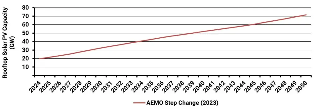
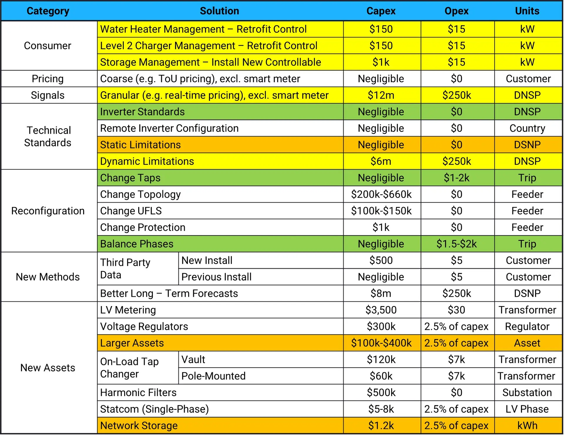
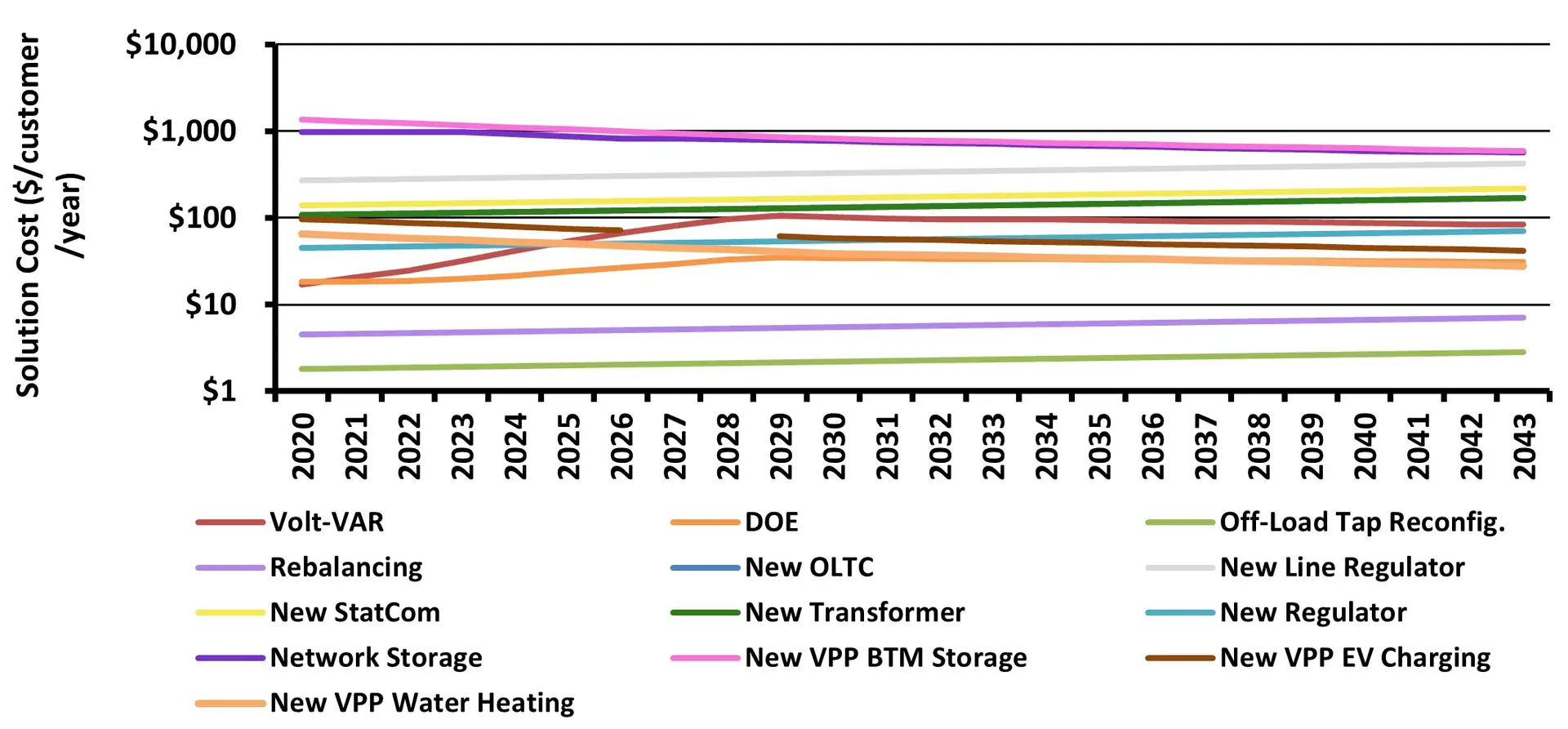
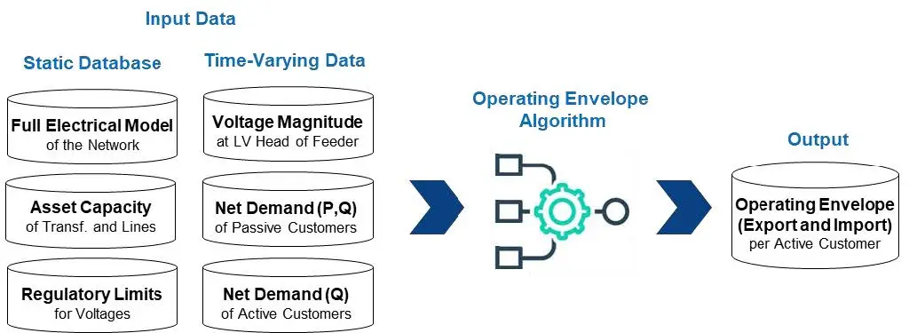
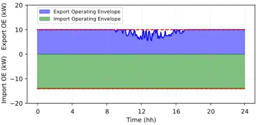
Unlocking the Potential of Consumer Energy Resources: A Path to a Cleaner and More Efficient Australian Energy Market
The AEMC partnered with Energeia to explore how flexible Consumer Energy Resources (CER), like solar, batteries, electric vehicles, and smart appliances, can reduce costs and

Bridging the Skills Gap: Workforces for Electrification
Australia’s clean energy transition demands a skilled workforce. Energeia’s analysis reveals urgent needs, strategic solutions, and policy pathways to bridge the electrification skills gap and